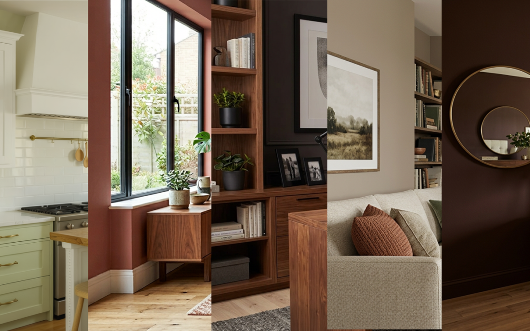
If you have been thinking about refreshing a room this year, 2026 is bringing a welcome mix of optimism and coziness to interiors across Indiana. National forecasts from SherwinWilliams and Benjamin Moore are converging on palettes that feel grounded yet uplifting, which lines up with what we are seeing in Hendricks County homes right now.
We’ve identified five colors we expect to be the most useful and loved in Indiana in 2026, based on national guidance and what local homeowners are asking us to put on their walls. We selected hues that read well in our fourseason light, pair easily with trim and flooring found in newer suburbs and classic ranches alike, and offer staying power beyond a single design season.
1) Celery SW 6421 (SherwinWilliams)
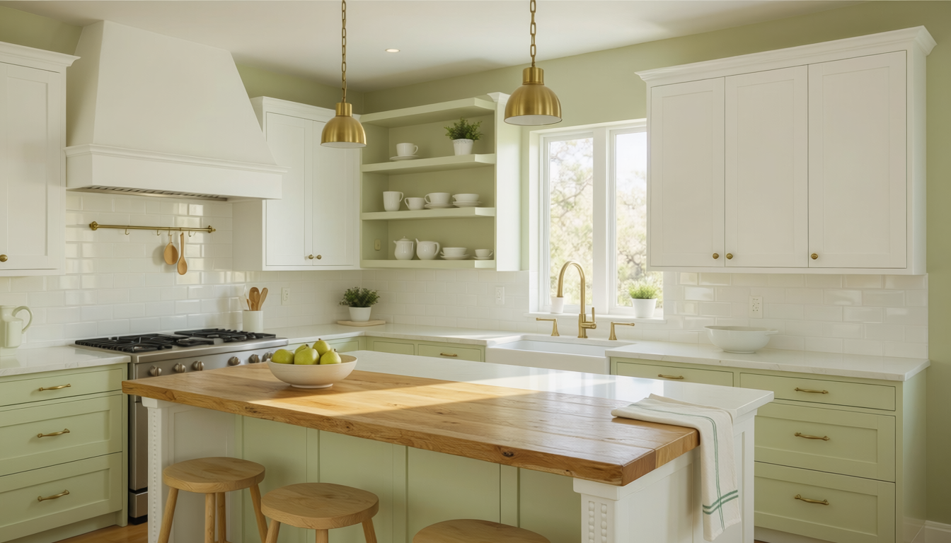
If you want a gentle lift without committing to a saturated green, Celery lives in that sweet spot between fresh and calm. It comes out of SherwinWilliams’ “Frosted Tints” family, which the forecast describes as cool, weightless pastels designed to complement each other in any combination. In practice, we find Celery brightens northfacing living rooms in Brownsburg and Avon where winter light can be flat, and it plays nicely with white oak floors, brushed brass hardware, and warm white trim.
2) Henna Shade SW 6326 (SherwinWilliams)
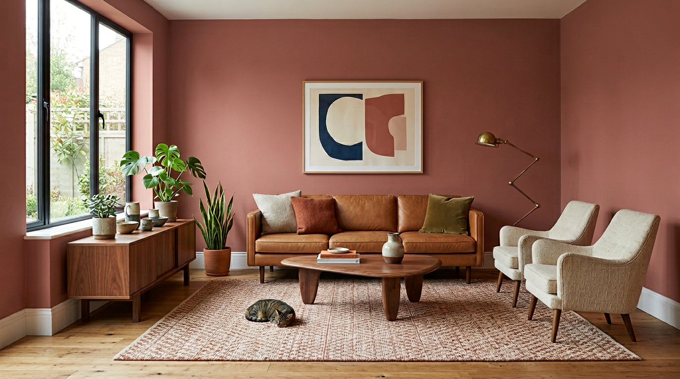
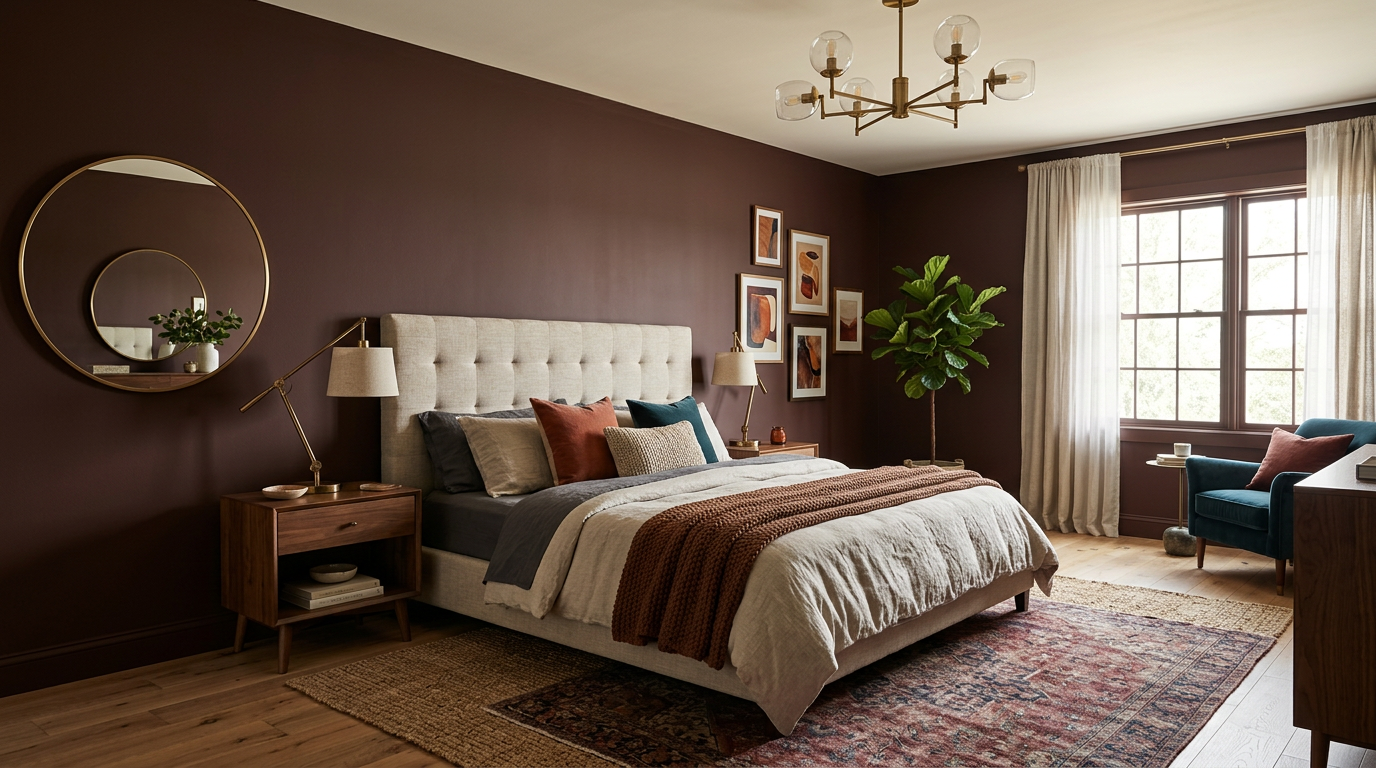
Terracotta and spiceinspired reds are evolving this year from trendy accents into livable wall colors when balanced with creamy whites and natural textures. Henna Shade sits in the “Sunbaked Hues” palette and brings that sunwarmed, midcenturymeetsmodern glow to dining rooms and dens without tipping into orange. In Plainfield and Danville, we have paired it with buttery offwhites and woven textiles to create intimate, wintercozy spaces that still feel crisp in July. Color details.
3) Silhouette AF655 (Benjamin Moore)
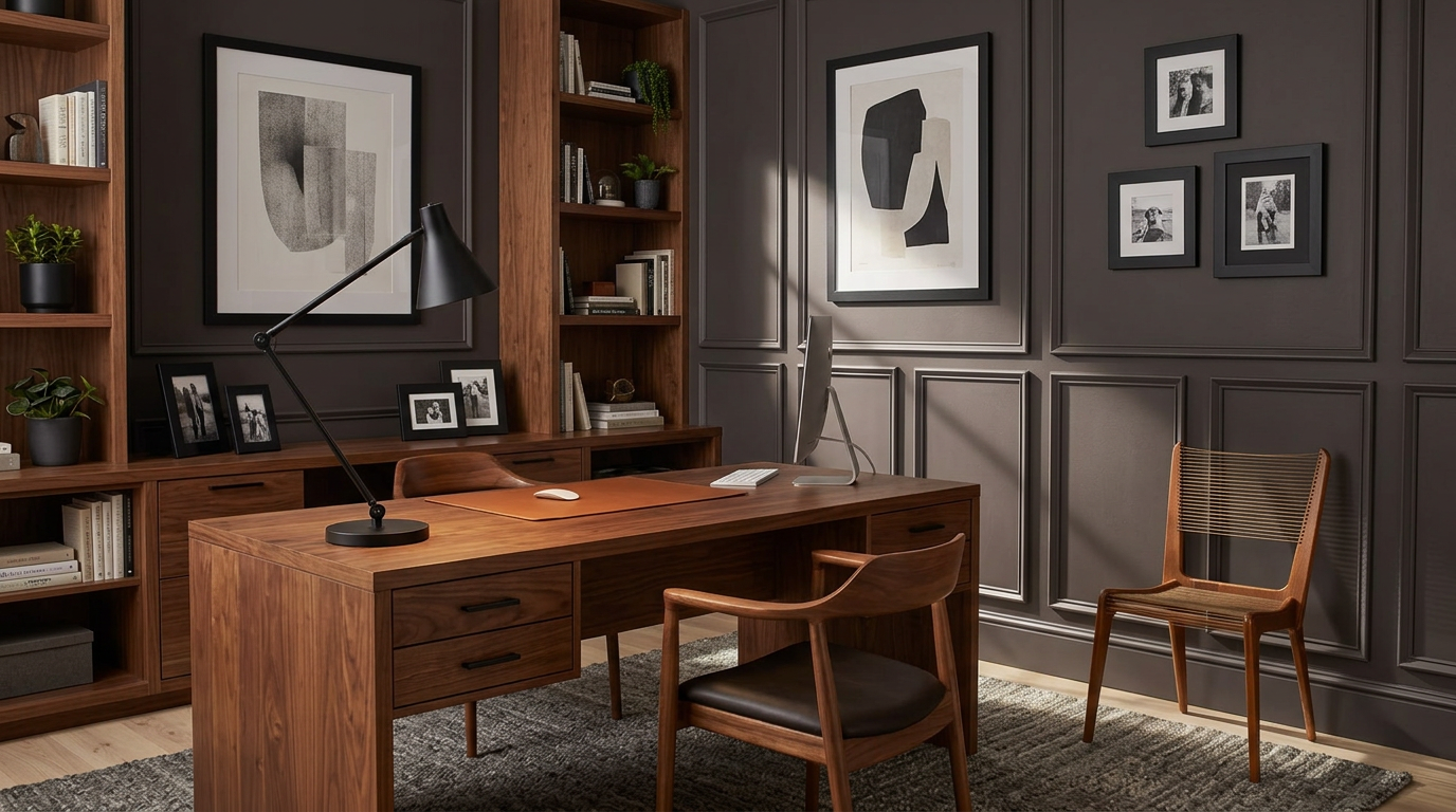
Benjamin Moore’s 2026 Color of the Year is a refined nearblack that blends espresso warmth with charcoal depth, and it is remarkably versatile in Indiana homes that favor warm woods and matte black fixtures. We like Silhouette on office walls, media rooms, or as a contrast color on interior doors with a soft white like Swiss Coffee on the trim. It delivers drama without harshness, especially under evening lamplight during our long winters.
4) Sanderling SW 7513 (SherwinWilliams)
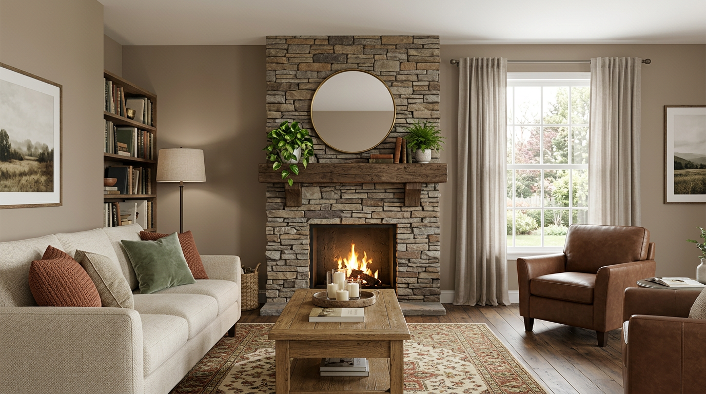
Neutrals are not going away; they are getting smarter. Sanderling, pulled from the “Foundational Neutrals” group in the 2026 forecast, has the kind of subtle complexity that flat grays never offered. It brings a warm, sandy undertone that cleans up beautifully in openconcept spaces across Hendricks County, helping tile, stone fireplace surrounds, and mixedwood cabinetry feel cohesive instead of busy. For homeowners shifting away from cool grays, Sanderling is a natural landing spot.
5) Rojo Marrón SW 9182 (SherwinWilliams)
For statement makers who still want sophistication, Rojo Marrón from the “Restorative Darks” palette adds a cocoared richness that reads like a modern heirloom color. We have used it successfully on accent walls behind headboards and in formal dining rooms in Avon, where it looks tailored with oilrubbed bronze, unlacquered brass, or even polished nickel, depending on the home’s hardware story. It is bold without shouting, and it ages gracefully.
From a practical standpoint, these choices reflect larger 2026 currents that go beyond a single brand’s announcement. Industry coverage has consistently highlighted the move toward airy tints, nuanced earths, and grounded darks, while noting how homeowners are personalizing spaces with richer palettes and layered finishes. That echoes what we hear at inhome consults across Hendricks County, where clients ask for color that feels calm on busy weekdays, warm for entertaining, and photogenic in natural light.
If you are unsure where to start, here is how we would think about these five in real rooms. Choose Celery for a living room that needs more daylight bounce and pair it with a soft white ceiling. Reach for Henna Shade in a dining room to create a yearround glow that flatters wood tones and evening light. Use Silhouette in an office to sharpen focus or on interior doors for a boutiquehotel impact. Lean on Sanderling when you want a wholehome neutral that plays well with existing finishes. Reserve Rojo Marrón for that one sophisticated moment that sets the tone for the rest of the design.
Ready to see these colors on your walls before you commit. We are happy to bring samples, look at undertones in your lighting, and recommend sheens that fit your lifestyle. Schedule a free color consultation and interior estimate with Flora Brothers Painting. Contact us today!